If you’ve moved a few times, you learn that home isn’t defined by square footage — it’s how it feels. The city, the view from the window, the floorplan, the neighbors, your own mental state — sometimes those details are what really decide whether a place feels like home.
You can live in a roomy three-bedroom and still not feel at home. Ever had that feeling? When nothing quite fits and everything feels off.
The living space can be generous, but the layout useless. Or the apartment itself might be fine, but the outside factors are terrible. There’s an industrial AC unit buzzing right under your balcony from the nearest grocery store, the view is of factory chimneys, and the stairwell is in such disrepair it makes you want to cry…
Against that background, any tiny but well-thought-out flat will look like paradise. Today I want to show you exactly that kind of studio.
Its area is only 22 square meters (≈237 sq ft), but thanks to an unusual layout and a balcony with a stunning view, the apartment feels much roomier.
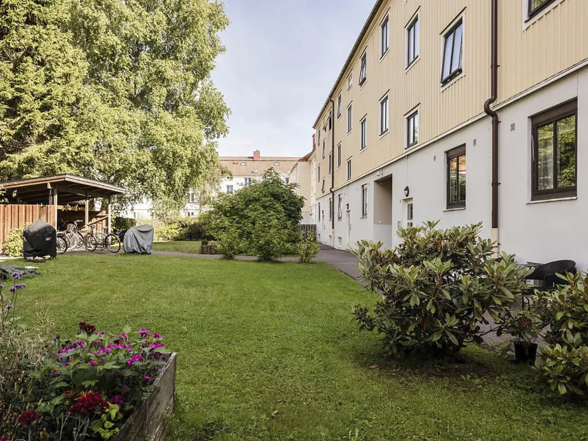
The flat is in a four-story building on the outskirts of Gothenburg (Sweden’s second-largest city after Stockholm — home to just over 500,000 people).

The location itself is surprising: the studio sits on an attic floor — a red rooftop extension.
The entire attic floor in this building is made up of these tiny studios. These used to be provided to single workers at the local factory. Now the studio we’re visiting belongs to a 34-year-old woman who also lives alone.

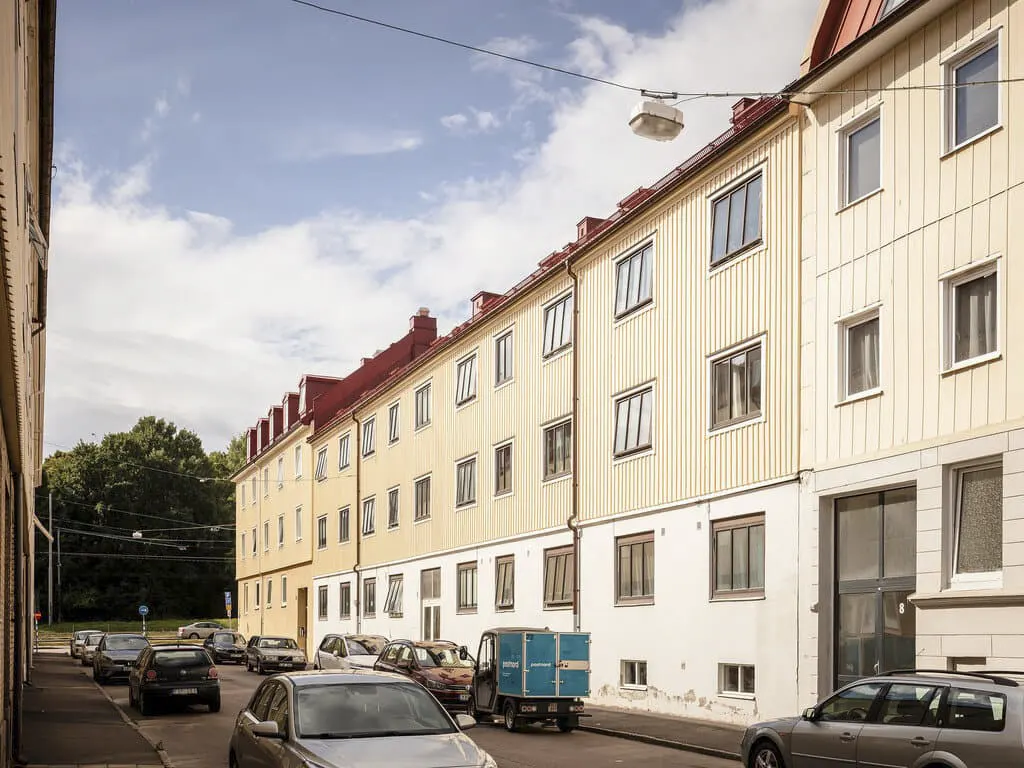
A view of the housing complex from above (all the attic flats have sloped walls and skylights).
Before we step into the apartment, I’ll show you the plan. That makes it a lot easier to understand how things are arranged here.

It seems like at least 30 square meters (≈323 sq ft), but that’s an illusion.

The kitchen is small but compact. The owner removed the upper cabinets (they were there originally), and that visually opened up the space — the sloped walls no longer feel claustrophobic and stop “eating” the room.
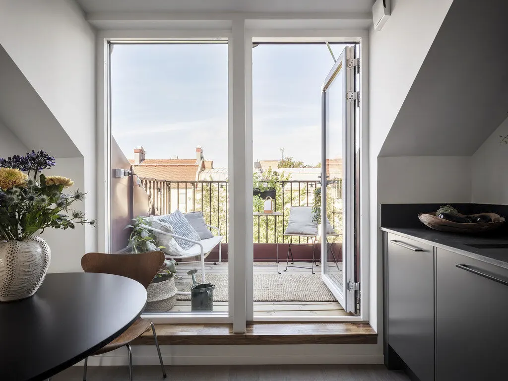
You can step straight from the kitchen onto a cozy balcony that looks out over the inner courtyard.
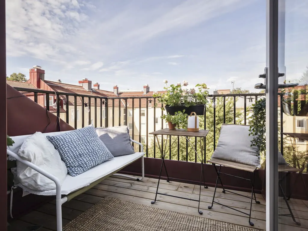
It’s a great spot to relax on hot days. In autumn, though, the furniture has to be covered with waterproof covers (there’s no canopy over the balcony to protect from rain and the occasional snow).
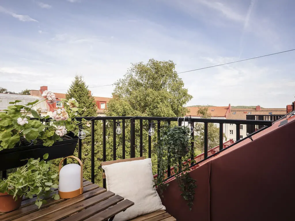
Geraniums, string lights, a garden lantern, and an IKEA table with chairs — the basic ingredients of coziness.
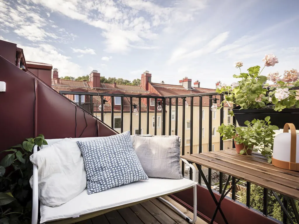
The owner took this iron bench from her neighbors on the same floor — they were moving and giving away stuff they didn’t need.
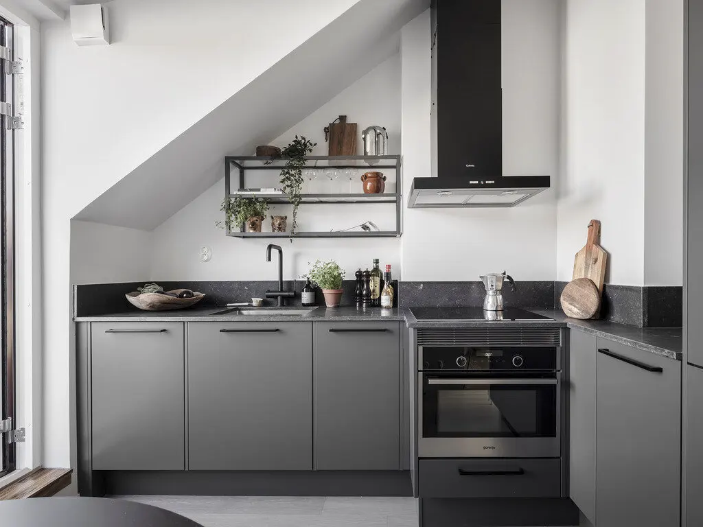
I’ve never seen such an unusual backsplash before. Paired with the geometry of the hood, it looks stylish. What do you think?
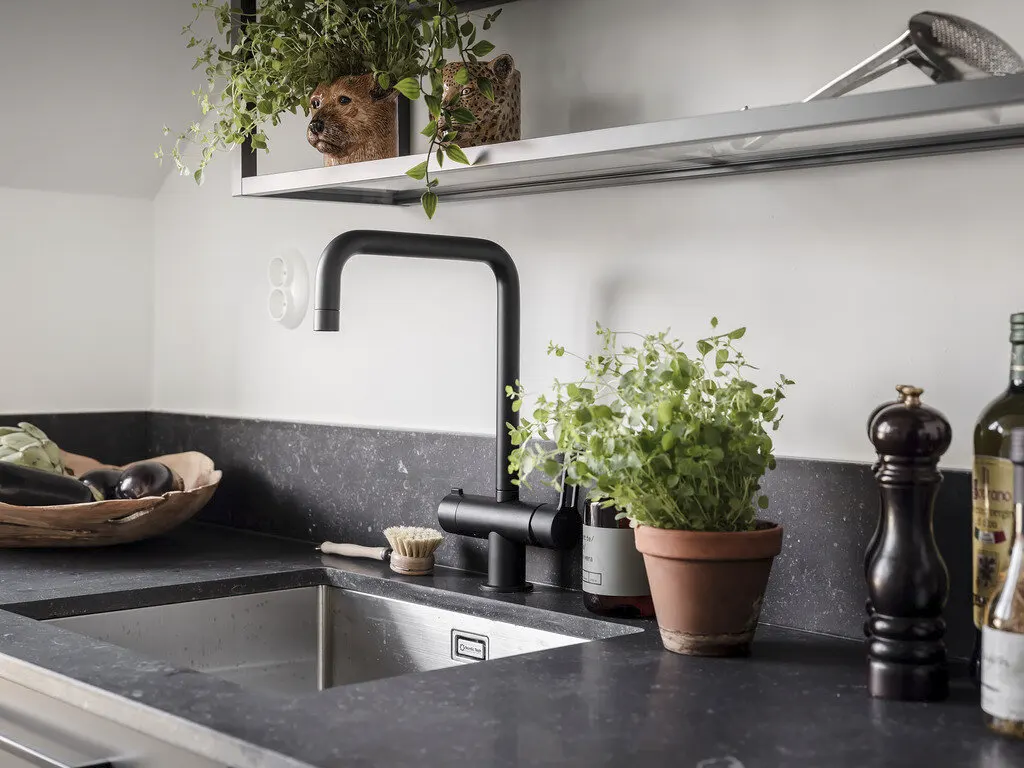
Check out the small flower pots shaped like wild animals. Cute, right?

View from the kitchen toward the seating area.

The apartment is very bright. That’s the main reason it feels larger than it actually is.

And here’s the tiny bedroom (which doubles as the living room). In the nook to the left sits the bed (and nothing else). Opposite it is a sofa that converts into an extra bed when needed.
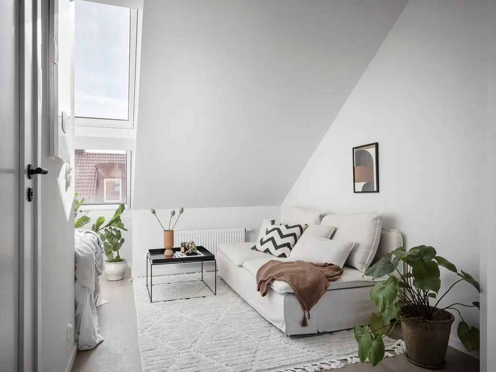
Green plants (there are quite a few for such a modest flat) freshen the space. Honestly, instead of the one plant in the right corner I might put a small bookshelf or a desk — I can’t imagine life without one or the other. But everyone has their preferences (maybe the owner reads only e-books?).
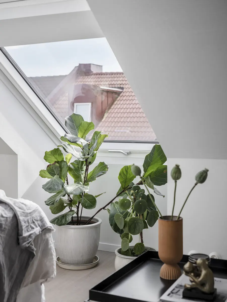
There are so many plants here!
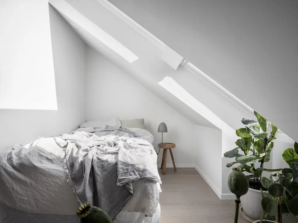
View of the bedroom. Perfect for one person.
Could you live in an apartment with panoramic windows?

From this angle you can see a slim wardrobe by the sofa where clothes are kept. Bedding and other textiles are stored in drawers under the bed.

The bathroom is located just behind the wall next to the bed.

The apartment really is very small. This photo makes the proportions clear. Some sort of tiny entryway, then the sofa, and the door to the stair landing…
That wraps up the tour of this tiny studio. What do you think of the layout? Pretty clever use of space, right? I’d love to hear your thoughts!


")


